Global data
“We can end extreme poverty”
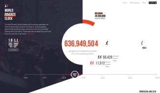
What does the World Poverty Clock show?
Our main goal is to build awareness of what is happening about poverty in different places across the world. We intend to present the best, most up to date, estimates of poverty and of poverty trajectories.
How is the reduction of extreme poverty progressing worldwide?
Well, at the beginning of 2016, about 727 million people – or 9.8 % of the world population – were living in extreme poverty. The figure for 30 August 2018 is 639 million – only about 8 % of the world population, which, by the way, has grown by about 200 million in the meantime. So the data is good news in the sense of showing that we are moving in the right direction. But progress is not fast enough. To be on track for achieving the first Sustainable Development Goal, the eradication of poverty, 40 million more people should have escaped poverty by this date.
Is there a real chance to achieve SDG1?
Yes, we can end extreme poverty. The resources and knowledge to do so exist, and we have real-world examples of how countries have been successful. At the same time, we are still facing large challenges that need to be overcome in many places.
Does the World Poverty Clock offer country-specific information?
Yes, you can see which countries are doing well and which are doing not so well. In general, countries in Asia, especially South Asia are doing quite well, while countries in sub-Saharan Africa are doing much less well. Many of these latter are faced with climate shocks and are experiencing episodes of violence.
In your view, where is need for action?
The focus of attention should be on Africa. This is where the speed of reduction of poverty is slowest and may even be sliding backwards. Compounding the problems, Africa continues to have high rates of population growth, and we should ensure that none of the young generation are left behind.
Why did you choose a visual depiction?
To build awareness, you have to engage with the audience. We found that few people understood or looked at World Bank graphs and charts, and these are too static. We wanted to emphasise the dynamics of poverty. We wanted to highlight that progress is being made as well as that many people are being left behind because the pace of poverty reduction is still too slow. To eradicate poverty by 2030, more needs to happen.
Where do you get your data from?
We use data from summary statistics which the World Bank publishes on the basis of household surveys. They are available on the Bank’s PovCal data base. We supplement this information with data on GDP growth, relying on statistics provided by the International Monetary Fund (IMF) and the International Institute for Applied Systems Analysis (IIASA) in Vienna, Austria. The IIASA has developed what it calls Shared Socio-economic Pathways for all countries in the world. It also has very good data concerning demography and population growth.
How reliable is the data?
There are of course issues with the quality of the data, especially in regard to comparing countries with one another. Different countries use slightly different methods to conduct surveys, so comparisons are tricky. We feel very confident about the country-specific trajectories, however, because the methodologies hardly change over time, so the direction of change is clear. That said, it is obviously very difficult to assess the situation in places affected by war. The good news, however, is that the majority of countries are not hit by massive violence, and the vast majority of the world population is not affected. Accordingly, our overall picture is quite accurate.
What implications does the Poverty Clock have for development policy?
Well, we should certainly praise the successes in reducing global poverty levels over the past two decades, but we should also be sounding alarm bells that the speed with which poverty is coming down is slowing down. If policies do not change, we will soon have to respond to a new narrative of much slower progress on extreme poverty reduction. Development policymakers must figure out how to deal with difficult places that do not have stable and effective governments, and places that are subject to shocks – impacts of global warming, health pandemics or conflict. Poverty is worst where these kinds of crises occur.
What is the Poverty Clock’s next goal?
We aim to produce sub-national data. We have successfully piloted the sub-national module in Kenya and have also been fine-tuning the methodology for Europe and the US where better data exists. We are now working on Pakistan, Brazil and Indonesia. We hope, through these efforts, to develop more automated techniques that we can then deploy globally.
We are also producing more fine-grained regional clocks, such as a clock for Africa, as well as extending the methodology to highlight rural poverty and perhaps clocks for other SDGs like hunger or water and sanitation.
Homi Kharas is a senior economic adviser of the World Data Lab as well as the interim vice president and director of the Global Economy and Development Programme of the Washington-based Brookings Institution.
hkharas@brookings.edu
Correction: This post initially included two irritating typos. The number 634 million was incorrectly stated in the lead paragraph (instead of the correct 637 million) as well as in the second answere (where the correct number is 639. The lead paragraph was up-dated when our e-paper was finalised on 30 August, whereas Homi Kharas authorised the Q+As in early August.

